Color Matching Made Simple: Create Cohesive Looks
Learn simple color rules, build on smart neutrals, and use foolproof palettes so every outfit looks intentional, polished, and perfectly cohesive.
Start With a Reliable Base Palette
Building cohesive outfits begins with a thoughtful base palette. Choose two or three dependable neutrals and pair them with two or three accent colors that flatter your natural undertones. Cool-leaning wardrobes thrive on charcoal, navy, and crisp white; warm-leaning closets glow with camel, chocolate, and cream; balanced palettes love taupe, mid-gray, and soft stone. Try holding fabrics near your face to see which shades make your skin look bright and even. Keep an eye on saturation and value so pieces feel related rather than random. If your neutrals are deep and saturated, select accents with similar depth. Denim is a versatile bridge color that links cool and warm palettes seamlessly. Aim for consistency: when jackets, trousers, and shoes share a tonal family, accents like burgundy, forest, or terracotta slide in easily. A focused palette expands options, making mix-and-match dressing simpler while ensuring every outfit feels intentional and cohesive.
Use Simple Harmony Rules
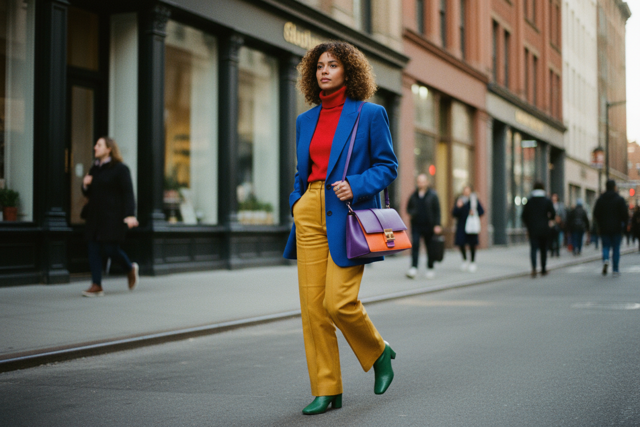
Once your palette is set, lean on easy color harmony frameworks. Monochrome outfits use one hue in varied tints and shades for quiet polish. Analogous pairings combine neighbors on the color wheel, like teal, blue, and green, creating fluid blends. Complementary mixes join opposites, such as violet with a mustard accent, adding energy without chaos. Triadic schemes balance three evenly spaced hues; soften them by choosing muted versions so the look remains wearable. Apply the 60-30-10 rule: anchor with a neutral at sixty percent, add a secondary color at thirty, and finish with a lively ten percent accent. Control saturation and value so bright does not overwhelm muted, and deep tones do not drown pale ones. For example, navy trousers (60), dusty sky blouse (30), and coral earrings (10) feel elegant and modern. These simple structures act like guardrails, guiding choices so every combination reads as harmonious rather than haphazard.
Build Cohesion Through Materials and Details
Color is powerful, but texture and finish are what make palettes sing. Pair matte cotton with a subtle-sheen silk, or balance a chunky knit against sleek leather to create dimension without adding more hues. Align metals to your undertones: cooler wardrobes shine with silver or pewter, warmer palettes glow with gold or brass, and mixed-metal pieces can bridge both. Keep an anchor item consistent, like a favorite belt or bag color, to tie outfits together. Consider denim washes as tonal tools: light washes soften pastels, mid washes ease transitions, and dark washes ground saturated tops. Repeat small details, such as tortoiseshell buttons or tan stitching, to echo colors quietly. Manage contrast by pairing deep bottoms with mid-tone tops for balance, then finishing with shoes that match either your bottoms or skin value. Thoughtful fabric choices, hardware alignment, and recurring accents create visual continuity that strengthens your color story without feeling overdesigned.
Mix Prints the Smart Way
Prints add personality, and smart strategy keeps them cohesive. Start with a hero print and extract two or three colors to guide supporting pieces. Mix scale deliberately: a bold floral pairs best with a fine stripe; a large plaid benefits from a micro dot. Treat stripes and simple checks as neutrals when their colors match your palette. Limit yourself to two prints plus one solid base to avoid noise. Maintain value harmony so prints share similar lightness or darkness, then let accessories echo a key color from the pattern. Keep spacing in mind: densely packed motifs feel more textured, while open prints read airier and need grounding solids. Use texture as a low-risk pseudo print; ribbed knits, cable patterns, and subtle jacquards add depth without clashing. When each element references color from the hero print, the eye reads unity, and your outfit looks considered, modern, and full of character.
A Practical Workflow You Can Repeat
Turn color theory into daily ease with a repeatable workflow. First, edit your closet to spotlight your base palette and remove outliers that never pair well. Create quick outfit formulas: neutral bottom, colored top, grounding shoe; tonal suit, soft blouse, metallic accent; easy dress, structured layer, patterned scarf. Photograph combinations in natural light and save notes about saturation, value, and best contrast levels. Build a travel capsule by sticking to one neutral family and two accents; ensure each top pairs with each bottom and both shoes. Shop intentionally with three questions: does it match at least three items, align with my undertone, and fit my harmony rules. Preserve color with smart care: wash deeper shades inside out, use cool water, and dry away from direct sun to maintain vibrancy. Rotate accents as temperatures shift, swapping brighter or deeper tones while keeping your trusty neutrals steady. Consistency turns getting dressed into a simple, creative ritual.