Color Tricks: Styling a Cozy Living Room That Feels Bigger
Smart color choices can make a snug living room feel airy. Learn palettes, finishes, and tricks that amplify light, height, and flow.
Soft Neutrals as a Spacious Canvas
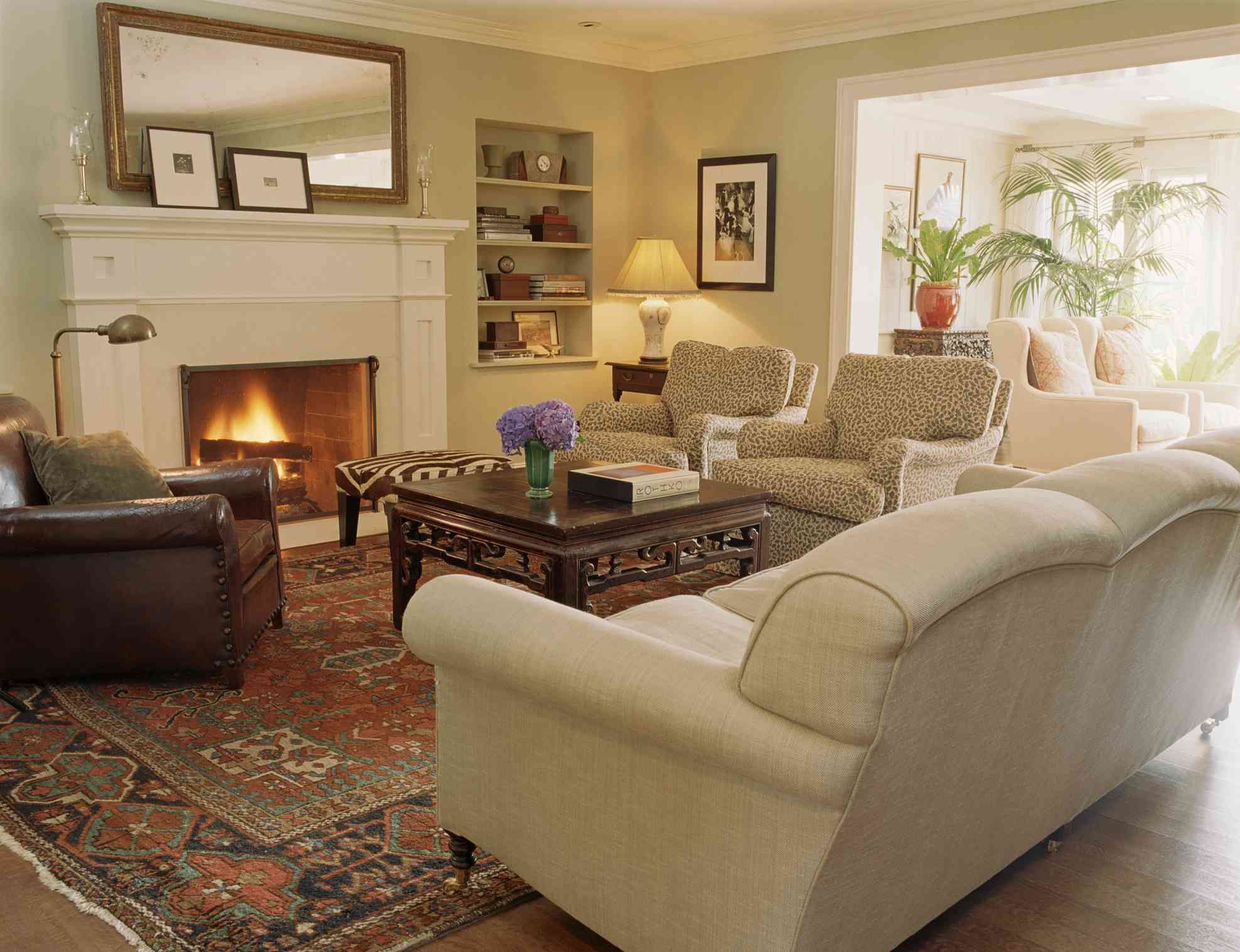
A cozy living room that feels bigger starts with a cohesive base built from warm neutrals. Choose hues like creamy ivory, pale mushroom, oatmeal, or soft greige with gentle undertones that flatter skin and soften shadows. These shades lift light without the stark chill of pure white, creating visual continuity that makes walls recede and corners blur. Prioritize paints with good light reflectance so daylight and lamplight can bounce around, then echo that base tone across large surfaces: walls, a substantial rug, and even the largest sofa. When big items agree in color family, visual noise drops and the space immediately feels calmer and more open. If you love wood floors, medium-warm planks pair beautifully with these comforting hues; top them with a rug just a touch lighter than the floor to extend the plane. Keep accent colors mellow at first, folding in soft clay, muted sage, or dusty blue as accessories so the room stays serene while quietly expanding.
Strategic Contrast That Still Feels Cozy
The secret to depth without shrinking the room is contrast that's soft, intentional, and controlled. Start with tonal layering: pair light walls with medium upholstery and a few thoughtfully placed deeper pieces, like a walnut coffee table or charcoal lamp base. This vertical gradient—lighter high, a bit deeper low—grounds the room while lifting the eye. Choose low-saturation colors for big items, keeping bolder shades for accents that you can swap seasonally. Lean into a monochrome scheme by varying just a few steps of lightness and darkness within one color family; the effect is rich yet quietly expansive. Patterns matter too: large-scale, low-contrast motifs feel airier than tiny, high-contrast repeats that can read as clutter. If you crave drama, try inky metal legs or a slim black picture frame; their small footprint gives crisp definition without chopping the room into pieces. Keep drapery close to the wall color so the vertical lines read as height, not hard edges.
Ceilings, Trim, and Doorways: Disappearing Lines
To create visual height, treat the ceiling as part of the wall color story. Paint it the same shade as the walls, or a tint just a touch lighter, so the corner seam softens and the ceiling appears to float. For stronger blurred boundaries, paint trim and doors the same hue as the walls, bumping the sheen slightly for durability while avoiding high contrast that outlines every edge. This edge control trick lets windows, door casings, and baseboards recede, so your eye reads uninterrupted planes rather than frames. Extend the wall color onto radiators, built-ins, or low-profile shelving for additional continuous color. If you use an accent wall, place it at the far end to push it visually outward, and keep the contrast gentle. Vertical striping can increase perceived height, while a soft, horizontal panel detail can widen tight rooms—just keep differences within a subtle tonal range. Finally, hang curtains high and wide to elongate openings and reveal more glass.
Texture, Sheen, and Light That Bounce Color
Color behaves differently across materials, so mix textures and sheen levels to guide light. Matte walls quiet reflections and disguise flaws, while eggshell or satin on trim offers a delicate diffuse reflection that adds glow without glare. Introduce tactile fabrics—linen, bouclé, wool blends—that catch shadows softly, and balance them with smoother elements like glazed ceramics or a low-luster leather ottoman. Mirrors and reflective surfaces amplify space when they echo the room's palette; position them to capture daylight or the warm pool of a lamp, not direct glare. Build layered lighting: ambient glow from ceiling fixtures, task light at reading nooks, and accent beams on art or plants. Warm bulbs with good rendering flatter earthy palettes and make neutrals feel inviting. Sheer curtains, ideally close to the wall color, filter brightness while keeping perimeters light. Transparent or slender furniture reduces visual weight; a glass-topped table or slim-legged side chair delivers function without blocking sightlines, maintaining the room's open, cozy rhythm.
Cohesion Rules and Low-Lift Refreshes
Tie everything together with color repetition and a simple formula such as the 60-30-10 guideline: roughly sixty percent for your main neutral, thirty for a supportive secondary, and ten for accents. Repeat each accent at least three times in small ways—pillows, a vase, a book spine—so the eye hops comfortably around the room. Protect scale and proportion by giving decor negative space; a little breathing room around art, plants, or a statement lamp keeps the whole from feeling crowded. For open flow into adjoining spaces, carry the wall color or a close cousin through hallways and entries, then modulate accents so each area feels related, not identical. Hide visual clutter with storage that matches the walls, and choose baskets or boxes in your secondary tone. When refreshing, swap textiles, lamp shades, or art mats rather than repainting. Always do swatch testing on multiple walls and watch the color through different lighting moments to confirm the cozy, spacious effect.